Trending Feed Card

Trending Feed Card

Enhancing Chatroom Discovery and Engagement in the Trending Feed

Enhancing Chatroom Discovery and Engagement in the Trending Feed

Role:

Lead UX Designer

Goal:

Optimize the design of chatroom cards on the trending feed to increase the conversion rate from static content consumption to chatroom participation.

Problem Statement

Problem Statement

Problem Statement

Challenge: Most users were not discovering or entering chatrooms. The existing chatroom cards on the trending feed were ineffective in attracting users due to their resemblance to ads, generic information, and misleading chatroom names. The challenge was to redesign these cards to make them more appealing and informative, thereby increasing user engagement with chatrooms.

Specific Issues:

  • Ad-Like Design: The design of the cards resembled in-app ads, leading users to ignore them.

  • Generic Information: The information on the cards was too generic and didn’t clearly indicate that they were related to chatrooms.

  • Misleading Chatroom Names: Chatroom names were often peculiar and confusing, potentially misleading users who were unfamiliar with chatrooms.


Design Challenges & Solutions

Design Challenges & Solutions

Design Challenges & Solutions

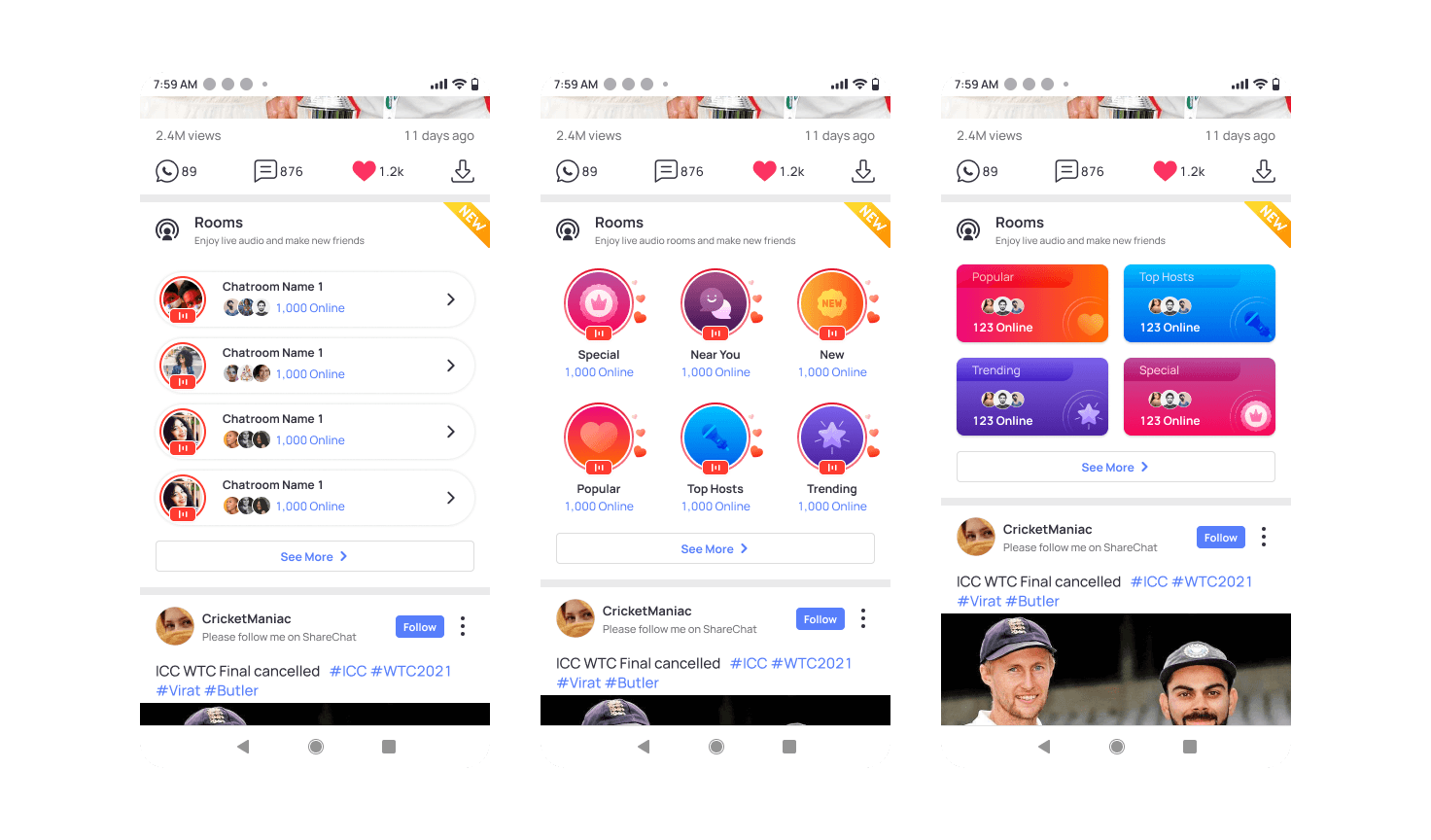
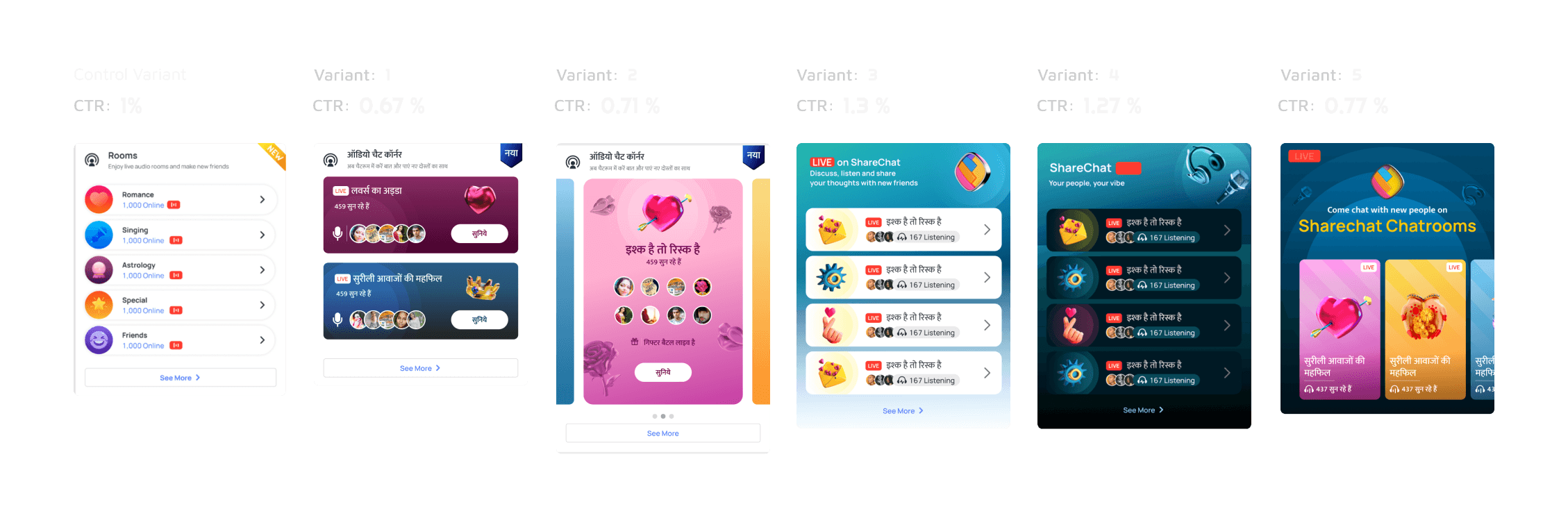
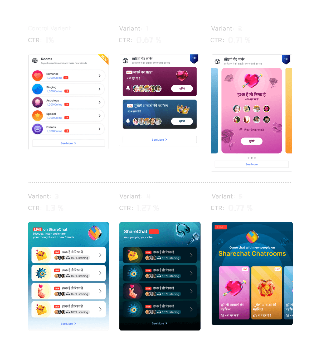
Challenge 1: Ad-Like Design

Solution:

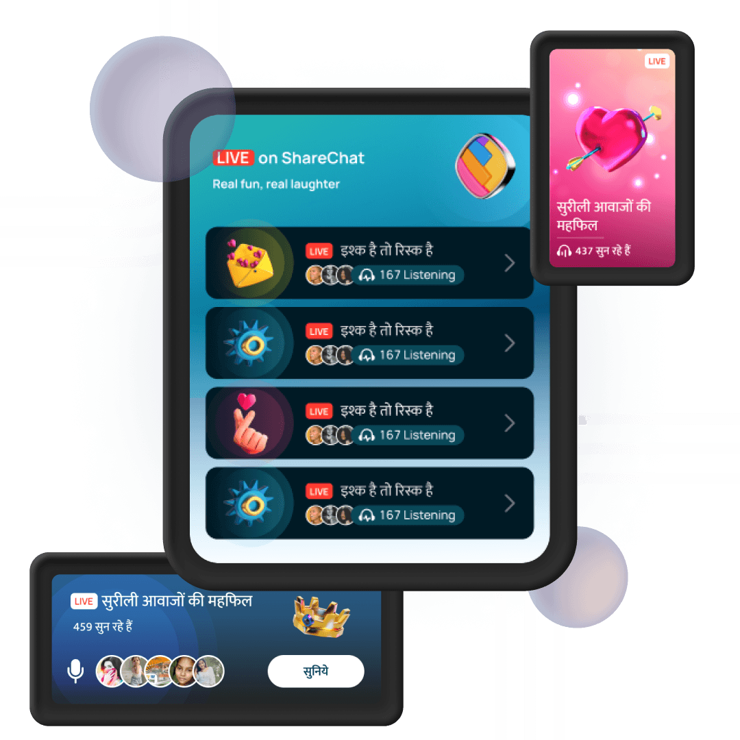
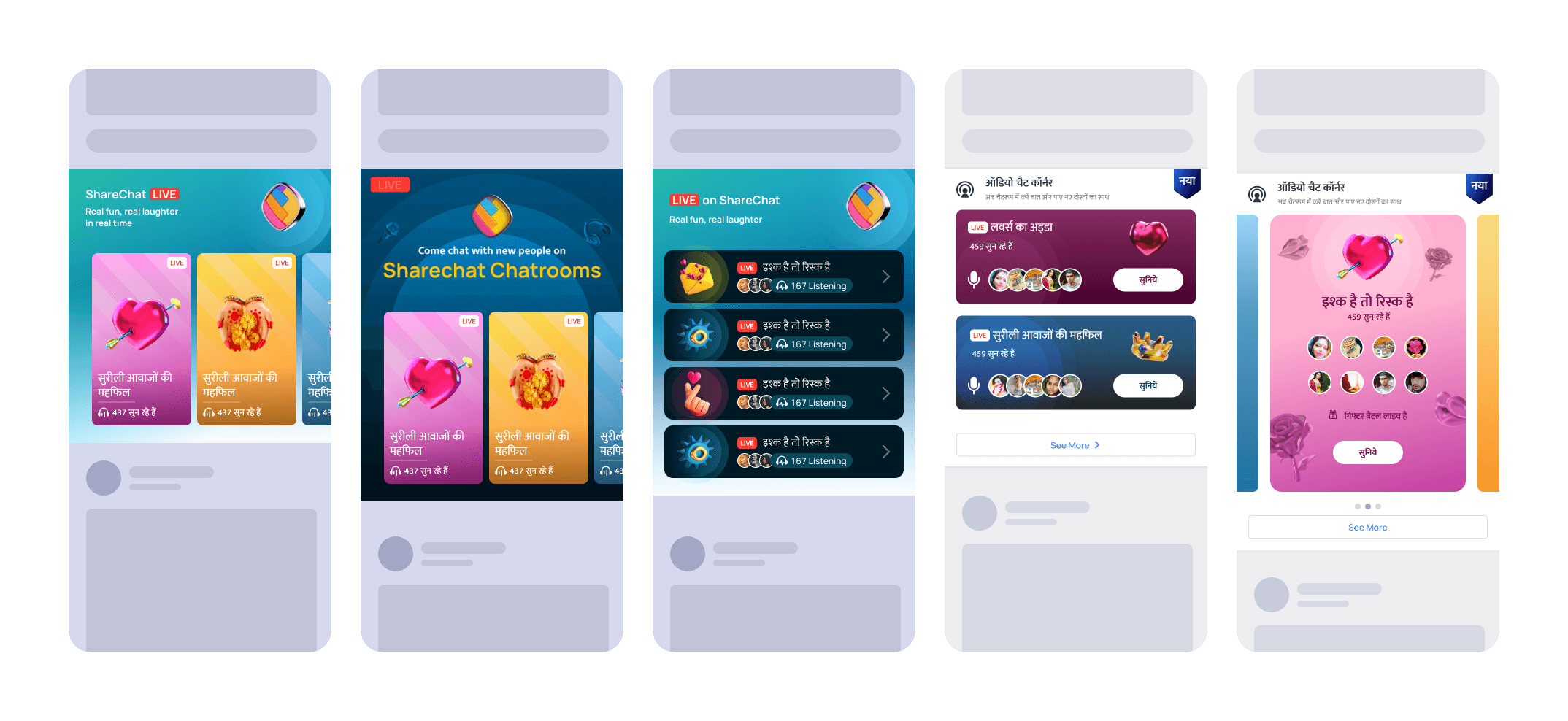
Introduced subtle brand identity elements to differentiate the chatroom cards from ads.
Used visually distinct styles and layouts to make the cards stand out as unique, engaging content rather than advertisements.

Challenge 2: Generic Information

Solution:

Replaced vague terms like “Online” with more descriptive terms like “Listening” or “Listeners” to indicate that the chatroom was an audio-based space rather than a text chat or video.
Added relevant illustrations related to the chatroom’s topic to make the purpose of the chatroom immediately clear to users.

Challenge 3: Misleading Chatroom Names

Solution:

Simplified chatroom names to clearly convey that they were rooms or groups focused on specific topics. The actual chatroom name could differ, but the card name needed to be straightforward.
Experimented with different card styles, such as using a “Live” tag and a headphone icon alongside the listening count, to visually emphasize that these were live audio chatrooms.

Final Design & Features

Final Design & Features

Final Design & Features

  • Custom Chatroom Names:
    Simplified and clarified chatroom names on the cards to make it clear that these were group spaces related to specific topics.

  • Descriptive Terms:
    Replaced generic terms with “Listening” or “Listeners” to subtly inform users that these were audio chatrooms.

  • Subtle Brand Identity:
    Incorporated brand identity elements in a subtle way to differentiate the cards from ads without overwhelming the user.

  • Visual Cues:
    Added topic-related illustrations, “Live” tags, and headphone icons to visually emphasize the live, audio nature of the chatrooms.

  • Experimentation with Layouts:
    Tested different layouts and styles to find the most effective design for engaging users and encouraging chatroom participation.

Outcomes

Outcomes

Outcomes

Reflection

Reflection

Reflection

  • Learnings: This project highlighted the importance of clear communication and visual differentiation in UX design, particularly when introducing users to new features or content types.

  • Next Steps: Future iterations could explore further personalisation of chatroom cards based on user interests and behavior, as well as additional experiments with different visual styles and layouts.

Create a free website with Framer, the website builder loved by startups, designers and agencies.